arrow_back

INDUSTRY INSIGHT

The Power of Typographic Influence

How typography is used to increase revenue

Typography never appears to steal the show, and is certainly due some credit in advertising, frankly, across the board. It’s an art form that can be a very influential tool in design, and it shapes and crafts its way into a user’s life. Like an influential friend, even, as a manipulator.

So, isn’t it time we start using it to affect our bottom line and user flow conversion rate?

There is much more to typography than meets the eye, although most grasp fairly easily that it is used for messaging. Font selection is the goal of finding a fitting type face for your mission at hand. Something that captures the moment, and presents it well. Some usual suspects would be restaurant menus, weddings, children’s snacks, sports, etc., etc. All have the obvious goal of capturing the moment, and setting the stage of what’s to come.

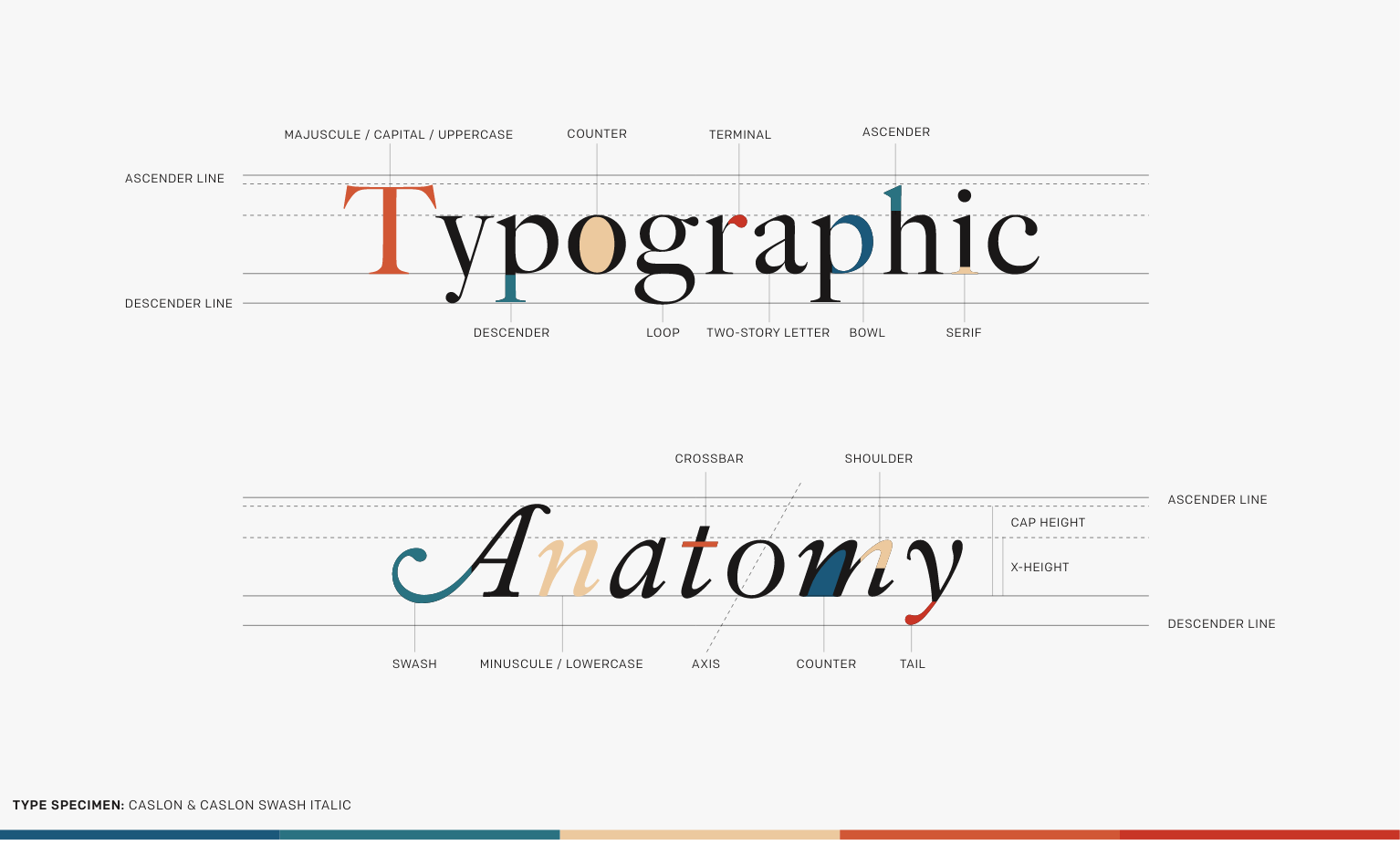
Let’s have a quick look at the anatomy of type, and the design elements that shape our perception.

post image

"Type is what meaning looks like."

Max Phillips \ Signal Type Foundry

post author image

The birth of cascading style sheets is what really brought digital typesetting up-to-speed with its long proven rival - print design. The huge digital shift we have been experiencing the past few decades has swung the pendulum in type foundry’s approach, and how the design community formulates their toolbox. The classic, expensive typefaces that dominated for decades, no longer hold market value. Before the wide spread of the internet, some typefaces were $2k, no exception. No one wants to pay $2k for a typeface with today’s tech at hand. Particularly if the digital equivalent simply does not exist. It is a huge branding mistake in today’s perspective, and sets the brand toolbox up for failure from the start.

If the digital typeface does not exist, you’re setting yourself up for cross-platform failure. Quote me on that. Digital typefaces are lightweight, and are built for cross platform consistency. They allow you to add style, content hierarchy, and craft a user flow. Most importantly, they provide us with choice of direction. News for you, when crafting your messaging, don’t beat around the bush. Tell the user/viewer/whoevs exactly what you would like them to do next. It’s ok to infuse personality, as long as it remains direct, and a short word count of course.

The true heroes in the market today are Google Type and Adobe Typekit.
Now that we have run through the basics of the what and how of typography, let’s move onto the real meat on the bones, the why. Or better yet, the return, the revenue.  When crafting a user experience that truly performs, clear direction combined with tone, and messaging can be the difference between a high drop-off rate, and a high conversion. Poor type selections, and mismanaged content hierarchy can instantly give off a sloppy perception. Perhaps sloppy isn't the correct term to focus on. Poor presentation leads to low conversion rate, that's a term that will grab all of our attention.

When a user is not clear what steps to take next, the original interest that brought them to your site quickly fizzles, and our attention economy is exposed. They don’t have time for this sh*t, and they abandon the pursuit. This is a story that sadly relates to first dates that never see a second. The littlest thing can be a deal breaker, the little things that shouldn't really matter.

The right font selection/pairing can enhance the purpose in messaging:

post author image

Enhance Experience & Perception

Heighten Conversion

Convey & Push Mission Forward

Differentiate at Market

Target Specific Demographics

Increase Revenue

This should go without being said, but typography is the grand master of storytelling. It controls how content is consumed. It is a friend telling a friend something of value. If perception is well thought through, this friend can be manipulative. This goes beyond branding, but into product clarity and experience. Education, instructional content, and elearning in particular lives and dies by the written word.

I think of the Ring doorbell we had installed awhile back. If the installation instructions were poor, resulting in frustration and a bad product experience, it would tremendously effect their bottom line. Reviews and word of mouth would destroy them alone. But they’re not, the Ring experience is simple, pleasant, and highly received. But when people think of the Ring brand, the important elements of type driven success never comes to mind. The unsung heroes.

Typography is body language that makes a great first impression. It enhances character, perception, and tone.

The perception of typography is a finicky one, and it leaves a lot of room for interpretation. But much of it is under our control, particularly the arrangement and stylization. This is where the separation comes into play, it is important to ensure your brand messaging is different, and stands out from the herd. 

You must view typography above aesthetic purpose, because it conveys emotion much like an image. Bridging the gap from content messaging, to relatability. It's the strength of this bridge, the fact that type has its fingers on the pulse of emotion that helps readers understand content better. Like any person, we’re all looking for things to relate with.

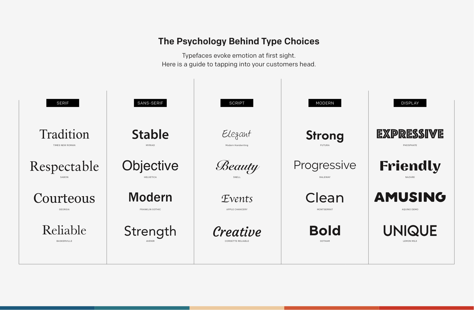
The truth is people perceive typography as personality, as human, providing the connection between consumer and product. Pairing a typeface personality with a brand mission has been a intuition based approach for years. With tech we are now getting closer to quantitative data, such as people’s ratings of different typefaces, their personality attributes, and overall humanness. Studies have already been formed behind the influence of typography in politics. A serif font is commonly associated with old way thinking, the printed word, high level education, or content level. ‘The old way of doing things.’ While sans serif fonts, although not new, have been adapted into today’s tech, and have become the essence of capturing a modern approach visually. With these preconceived notions, a political party can shape messaging to speak to these core values in people, such as an old time thinker will most likely relate to an old appearing serif font, while a younger generation may relate closer to what appears to be new age thinking of a modern, sans serif font. Same messaging, same region, 2 different approaches.

This draws us to the next question, can perception override content? In political form, perhaps it can. It has the ability to enable people to lean, if you were on the fence with a candidate, and the campaign is redesigned with a new type face, it can sway you back in their court. It builds trust and instant credibility.

This is why you hear typography being a version of body language, the tone of voice and delivery that make people so like-able. It delivers charisma, and injects mood and ambiance to an environment at first sight. You may have seen a similar graphic online, but I have expanded greatly on this, and broken it down a little further.

I also recommend checking out typetasting.com. I love what Sarah Hyndman has going on. She is on a mission to change the way we think and talk about typography, by making it fun and exciting for everyone. She is challenging assumptions and preconceptions of type, and I’m a big fan of her work. Kudos, Sarah.

My wife often rolls her eyes at me when I go on about typography. In response, “You wouldn’t be wearing that graphic tee if it wasn’t for that cute handwritten font.” That my friends is revenue based typography at its finest.

In close, typography is a power that greatly influences the mind, and color is a power which directly influences the soul. Combining the two creates a powerhouse in your design toolbox. But, just running with aesthetically pleasing design is not enough. Without evidence, all you have is hope.

Hope isn’t good enough in my book.


post author image