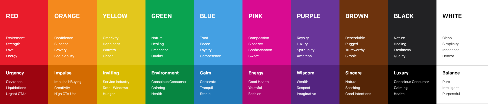
Blue - makes you feel safe and relaxed. Heavily used in corporate branding because it is considered the most gender balanced color in our spectrum. It evokes feelings of calmness, trust, and security. Ask Facebook and Twitter. The blue spectrum dominates branding in a corporate environment, mainly due to its gender free accessibility. Besides the social giants mentioned above, here is a few more to make my point: General Electric, AT&T, Intel, Hewlett Packard, Ford, Nokia, Samsung, Philips, PayPal, Nivea, Visa, BOA. This list could truly go on for days, and you’d be amazed at how widely blue is used in brand categories across the board. Kudos to its gender free relatability.
Pink - playfully romantic, pink represents femininity, sensitivity and things that we hold close to our heart. Pink can be sweet, cute and charming. It’s an interesting color because it’s so suggestive. Many will think of brands such as Victoria Secret’s Pink, Barbie, or Cosmopolitan. But the brands that lean the other direction such as: T-Mobile, Lyft, LG, or Pepto Bismo are the ones that raise my eyebrows. Pink can be gentle, and it can pop, which is the exact point of allowing pink to sit in the driver’s seat. It demands attention in our attention economy.
Purple - bring on the creativity. Purple is associated with royalty, wealth and mystery. Lighter hues are commonly used to soothe and bring a calm sense to design. Often used in the beauty industry, high luxury and where romance is needed. Prime example, Crown Royal, the exact definition of royalty and wealth projection.
Brown - can be a contrasting emotion. Often associated with health, natural, stability and support. It's a warm friendly color that represents the old times and well-established entities. This one may make you think for a moment, besides the usual suspects of UPS and Hershey. It’s heavily used in the indulgence sector: Cracker Barrel, M&M’s, Dreyer’s, Godiva, Nespresso. Makes sense the more you think about it. UPS is due to the relation with cardboard, might not mean much today, but when they started, cardboard represented a whole new approach to mail.
White - brings simplicity and minimalism to the design. It offers a simple clean look. In some cultures it can be associated with negativity. Most commonly the color of innocence.
Next, we’ll dive into sharpening our color toolbox to improve conversion and advance usability.