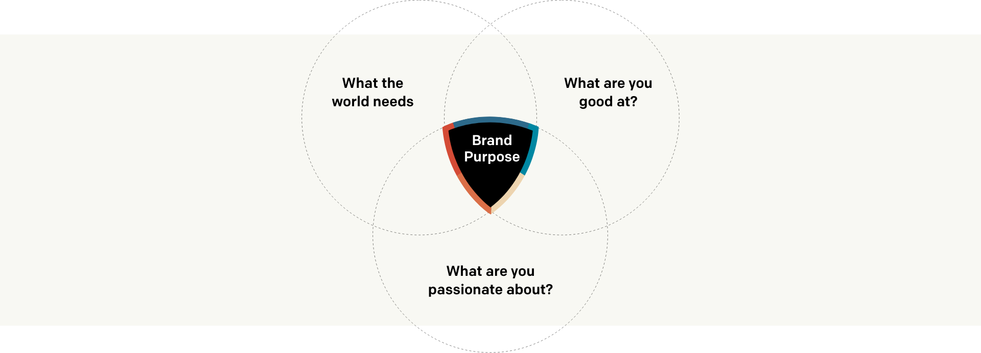
arrow_back

Creative Insight

Does Your Brand Convey Purpose to Outside Eyes?

10 essential brand elements your passion-driven brand must get right

I’ve read a good amount of design articles in my time, and they all preech purpose-driven this and purpose-driven that. We all understand purpose in our head, it’s the reason. The problem I found with these articles, is that as good as they are about preaching the why, they gloss over or intentionally stay clear of the how. With that being said, I have made a conscious effort to provide as much how as possible.

If we were to analyze a well-executed brand from A to Z, such as Nike or Google, what core elements would we find in our search? Besides the highly recognizable logos, that only really cover the ‘A’ portion of our brand alphabet, what would we find when referring to everything else, B through Z, or better yet, what should we find?

Passion driven brands shouldn’t be hidden or struggle to tell their story. I’d like to discuss passion a little bit deeper with an observation I have made over the years. When I meet up with a CEO or startup founders to discuss their business goals, the first thing I look for is the passion. It should be seeping out of them like an electric energy. They should appear so eager to share their story that if a ladder were in the middle of the room, they would auto-pilot their way up it, and start the gospel.

Passion drives purpose, and a purpose-driven brand is motivated by their core mission and goals. This core mission must not fall short, and must be the essence of their brand. A purpose-driven brand is 100% beneficial to the bottom line, there’s no doubt about it. But, profit must not be in the driving factor if you would truly like to capture the hearts of your audience.

Branding, when executed well, will convey and drive purpose forward. It will continue to manifest the mission and the story, once the passionate leader is no longer in the room. It stretches far beyond the common brand basics that are seen in most half-baked style guides across the digital stratosphere. It should cover all touch points and be well planned.

And from my experience, if you cover these 10 essential brand elements below, your purpose-driven brand will be set up for many successful years to come.

Let’s dive in!

post image

"Have a dream, chase it down, jump over every single hurdle, and run through fire and ice to get there."

Whitney Wolfe \ Bumble CEO

Purpose

The definition of Purpose is the reason for which something is done or created or for which something exists. The way I see it is we take the overlapping circles above, and dead in the middle lies the purpose, but in simple words: It’s why your company or brand exists, and this rides on the ability to convey it to the world.

I like to start with the general theory of Simon Sinek’s Golden Circle Model for value propositions. It states that you always start with the ‘Why’. If you successfully articulate the ‘Why’ as the core focus of messaging, it becomes a very impactful way to communicate and inspire action.

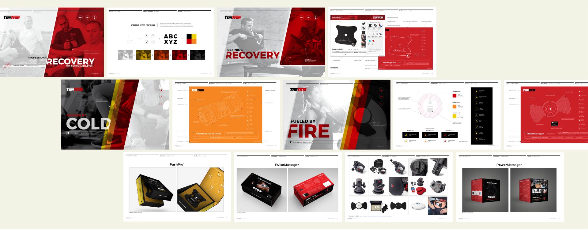
So how does a brand showcase purpose, the why, the contagious passion of the entreprenuer?

Capturing unique qualities of a brand is not a one size fits all approach, but there is one core element that never changes; emotion. The key to capturing and visually conveying brand purpose is to tap into the emotional states of the viewer. To do this well, try to avoid the problem of why the product/service exists and showcase the emotional payoff.

Let’s take Nike for example. They don’t showcase the athlete on day 1, they showcase the athlete well on their journey. They empower and feed the mentality of the athlete in all of us, ‘If you have a body, you are an athlete’. This message goes far beyond the headlines; it goes into intentional imagery that captures emotion. It goes into the edgy graphic choices that capture the athletic grind. It contrasts the perfect body image media portrays, beautifying the scars and imperfection. It places hard work on a pedestal, and hard work is something everyone can emotionally relate with; the grind.

“Believe in something, even if it means sacrificing everything.” – Nike. This bold headline captures the essence of Nike’s brand messaging. Tapping into emotions can drive action, educate and empower. It can also manipulate consumers feelings and stimulate the emotional triggers that influence decision making. It can invoke anger, sadness, inspiration, and push for change.

There are many great examples of emotion driven brand messaging. Lysol, for instance, nailed it with their Protect Like a Mother campaign, which inspired, and empowered their consumer base. It was strategically launched during Mother’s Day making this campaign a home run. Additionally, Unicef also taps deep into the emotions, invoking anger. Their ‘Parenting is Also Learned’ campaign goals were to raise societal awareness about how the negative effect of violence, abuse and neglect has on a child’s development.

Connect brand vision, mission and values with strategy

Let’s get into the meat that makes these words so heavy weighted. We’ll take a simplistic approach to simply avoid tired eyes and in-depth essays.

Vision – Goal driven - Where you want to go - when you want to arrive - aligned with the purpose.
Mission – What bold moves do you need to make to achieve the vision.
Values – How you behave as a brand, the behaviors and attitude you display.
Strategy – Plan that encompasses specific, long-term goals.

For starters, it’s ok to think big when it comes to vision; the bigger the better. Bigger things however can feel more intimidating, and to simplify, they need to be broken down into goals with bite size steps. These steps become the strategy, and this is where you create opportunities to insert company values.

Values can surface in places you would not expect. For instance, a clients brand I recently developed had a complex market solution to address. To simplify the complexities, we intentionally showcased the key value of: Approachability. Like a person, this complex solution could not be intimidating and had to remain inviting. It had to retain the warmth of a patient teacher attempting to teach you something new.

The way we achieved this is by bread-crumbing the digital experience. This provides a road map to the users time commitment, and it displays where they are within this mini journey. It visually speaks to the user and ensures them the process will only take a few moments, keeping each step simple, digest-able, and engaging. This kept things human, and provided an opportunity to breath in between each step. It helped simplify the complexities within the educational curve, and delivered the can do attitude once platform confidence was gained.

Voice

It is important to infuse personality and emotion into your brand messaging. It encompasses everything you stand for, from the words and language, to the personality and image your marketing assets aim to invoke. Personality in today’s digital age carries a lot of weight. Brands must remain human to the core, have a sense of humor, and be relatable at a micro level.

Harley Davidson does it well by challenging the reader’s to ask themselves if they are worthy of handling one of their motorcycles. These bold headlines capture the outlaw tone.
• Grab life by the bars
• Resistance is futile
• All for freedom. Freedom for all.
• Built to shred city streets

Messaging

Great messaging conveys the emotion behind your brand. It explains the story of how you were founded, along with the reason why your product/service is important to the world. A brand messaging framework conveys the emotion behind your brand, and it’s the foundation to all successful messaging.

Empower your target audience

Empowerment is providing consumers with options, tools, and resources to facilitate decision-making; simple right? When combined with strategy it can become a powerful tool in your brand arsenal.

Brands can actually do things around an “empowerment strategy”. For example, if you want a certain demographic to buy into your brand’s particular vision of health and well-being, you can give them tools, events, language and a community to boost each other. You can share stories that help people achieve their wellness goals related to the targeted vision, and in a content-laden media and marketing world, these kinds of actions can be incredibly effective when it comes to building brand relevance in people’s lives. But, it has to be authentic. When it comes to vision empowerment, it can become easy for the message to be misconstrued. Such as in the sports or beauty industry; it almost has a shaming or bullying approach. Which can gnaw away at one's self esteem and fester into the opposite of empowerment. Powerless.

pushgo_icons
p20-slider-1-1
p20-slider-1-2
p20-slider-1-3
001
000

Know your demographic

Research. Research. Research. Sales 101 - know who you’re talking to. On too many occasions we’ve seen businesses miss the mark on this step. They think they know their true audience. They think they know their ideal target based off of vague data, or embellished expectations trapped in their head.

When it comes to defining your target market, you must first identify your typical customer, and target your marketing accordingly. Having a well defined target market is more important than ever. No one can afford to target everyone. By defining, and targeting a smaller niche market, a small business can now go toe-to-toe with larger companies.

Targeting a specific market does not mean that you are excluding people who do not fit your criteria. Rather, target marketing allows you to focus your marketing dollars and brand message on a specific demographic that is more likely to buy from you than other markets. This is a much more affordable, efficient, and effective way to reach potential clients and generate business.

Let’s compare two dating app’s to see the differences in speaking to two separate demographics. Tinder is primarily for young adults, and it relies on social media, events, and promotional goods as marketing opportunities. While
Our Time celebrates the 50+ demographic and relies heavily on email marketing to reach their community. These two separate approaches speaks volumes to their demographic’s personal preferences of communication, and how they go about their day.

thrive_style_1
thrive_style_2
thrive_style_3
thrive_style_4
001
000

Highly executed
style guide

A well-executed style guide will unify internal and external storytellers, partners, and vendors, and be the foundation in consistent messaging and visual stylization. It should cover much more than the brand basics: logo variations, do’s and don’ts, colors and type. It should teach the assembly of parts to all team members, and it should conquer any educational curve consumers may face. It should cover ALL digital, print and retail environments, and it should lead the charge to manifesting the core mission to outside eyes. But most importantly, it should echo the brand story, while the passionate founder sleeps soundly at night.

Here is a style guide that nails these 10 essential brand elements: Thrivelution Style Guide

Consistency to the core

This refers to the delivery. Messaging must be in line with the brand identity, values and, strategy over time. Consistency ensures that your target audience is being exposed to core messages and visuals, along with other brand elements repeatedly, which can help to solidify recognition.

But, do not get consistency confused with repetition. Consistency helps avoid a Frankenstein brand to outside eyes. Be consistent and presentation-ready at all touch points.

Ensuring consistency is easy if you address everything as a style within a system. Style guides and component libraries have the right approach. It allows you to predetermine stylization, rules, standards, and use cases in a controlled environment. One way to deliver consistency without feeling redundant, is to repurpose existing content and visuals with an additional creative spin. This approach is often taken when a brand extends its product family into another line.

A great example of consistent branding is when you see a commercial and you instantly recognize the brand before ever seeing the logo. The videography, audio, typography, and colors equate to the brand experience. This is how Target gains visual recognition utilizing the simple stylistic use of their red. Gap utilizes its blue typography while McDonalds leans on subtle catch phrases, colors, jingles and voice overs. All delivered with consistency to hopefully gain easy recognition in consumers heads.

A running list of
things to avoid

Every industry has trends and common approaches that quickly become overused. The key is to not fall into line, and to differentiate, in order to stick out from the herd.

Here are some common missteps to avoid:

  • Overused stock photography
  • Color palettes lacking depth and accessibility – when I form a color palette I always aim for contrast, allure, demographic appeal, and I reserve a strong garnish (use it sparingly) color for CTA and UX purposes.
  • Treating platforms as silos – a good example of this is marketing and social teams not being on the same page resulting in contrasting messaging from one platform to another
  • Confusing consistency with repetition
  • Putting on an act – companies jumping on the go green bandwagon with no real intention of fully committing
  • Rushing to publish inadequate content, and logos that deliver confusion at the front door.

Truth be told, this list could go on for days, but these hit home most often.

In summary

In close, there are many layers that go into an A to Z brand experience. Visually capturing and delivering brand purpose that connects to the human emotion is a pretty tall order, but when orchestrated well it can deliver the wow factor, and make viewers wonder where has this been my whole life.