arrow_back
Project header image

Pebblebee

CREATIVE DIRECTOR

Phil Padilla

Agency

GB Productions

Lost no more – is it really this easy?

My introduction to the Pebblebee tracking technology was a quick reminder of life’s frustrations that should no longer plague us in this day and age. With tracking technology gaining momentum, it was Pebblebee’s main objective to optimize growth by bringing the bulk of their sales in-house for self-fulfillment. For that to happen the website needed to be updated and e-commerce infrastructure needed to be built out. Next the brand needed to be revitalized and marketed to drive curiosity, optimizing traffic.

This brand revitalization scope included a complete customized Shopify ecommerce experience and refreshed digital campaigns. This cohesive design system went full circle, covering a packaging refresh for all Pebblebee current products, and for the release of their new wallet slim BlackCard.

Reminding us all of our corky youth

This campaign was inspired by the long route home, often on a path less traveled, I fondly remember as a child growing up. This often resulted in me needing to retrace my footsteps to find my long lost items, which integrated into the visual aspect of our branding and storytelling.

That inspiration was the spark of what manifested next, portraying the youthful memories of the consumer by utilizing color, illustration, and the dotted line to tell the story of the tracking pathway.

Let’s take a deeper dive into the Pebblebee product family.

p1-slider-1-1
p1-slider-1-2
p1-slider-1-3
p1-slider-1-4
001
000

The design process

Brand Centric Color Palette – Overlaid colors are used throughout this campaign, combined with the ‘doodle approach’ art, that drums up the childhood tone. This treatment allows products within the photo content to be isolated, and draw more attention. It also allows the introduction of supporting stock imagery with a brand centric twist to escape the ‘meh’.

The Doodle-Approach – This charismatic illustrative addition builds depth through nostalgic memories, opening the door for relatable elements from the audience’s youth.

Supporting Illustrations – Echoing on the doodle-approach concept prominently displayed throughout the campaign, these illustrations display the range of product use in a simple, digestible way. They tell each products story and their practical use in a real world scenario.

p1-slider-1-1
p1-slider-1-2
p1-slider-1-3
p1-slider-1-4
001
000
Image
001

Interchangeable Sales Content

Dynamic Mastheads

UX/UI & Strategy

Responsive Block Elements

Image
002

Custom Tailored

Key Value Propositions

Call to Action's

Custom Iconography

The difference is often found in the details

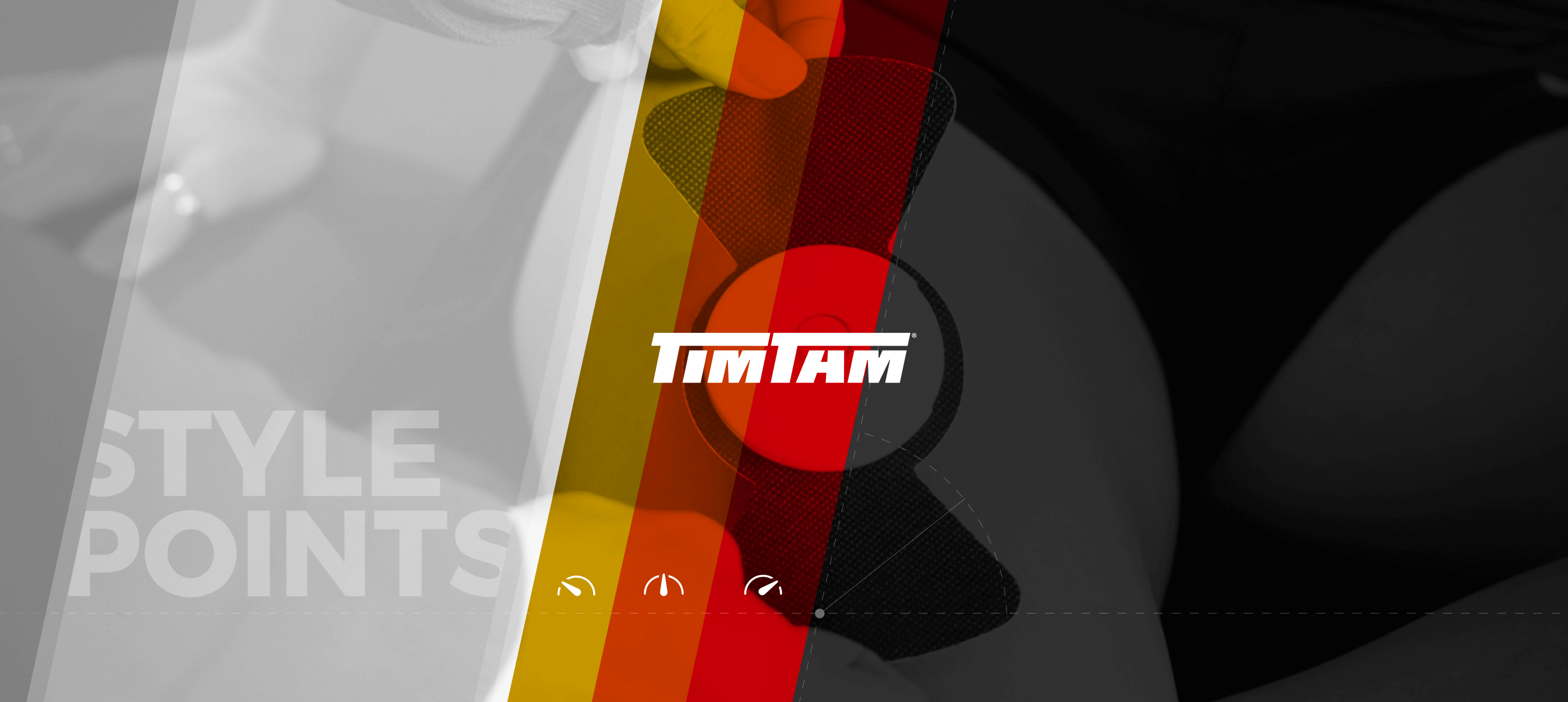
With a saturated category, the details are often what defines differentiating aspects of the brand and products. Those details are often defined early within the design stage and set the foundation for a cohesive system from concept to delivery. Working hands on with the Shopify development team ensured quality control and the proper direction and execution of vision.

Here is a breakdown of the commonly underrated details utilized in this project.

Product & Supporting Iconography – Tech specific, no primary language is necessary.

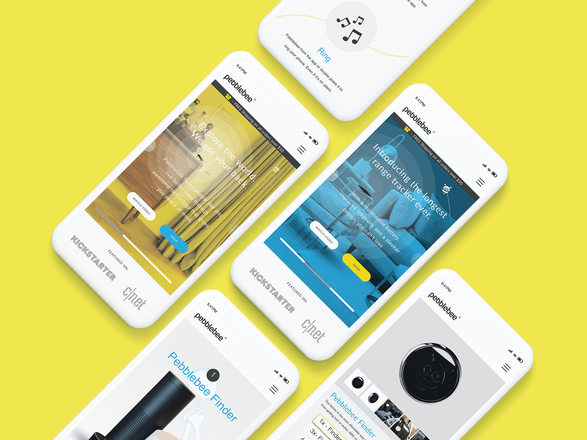
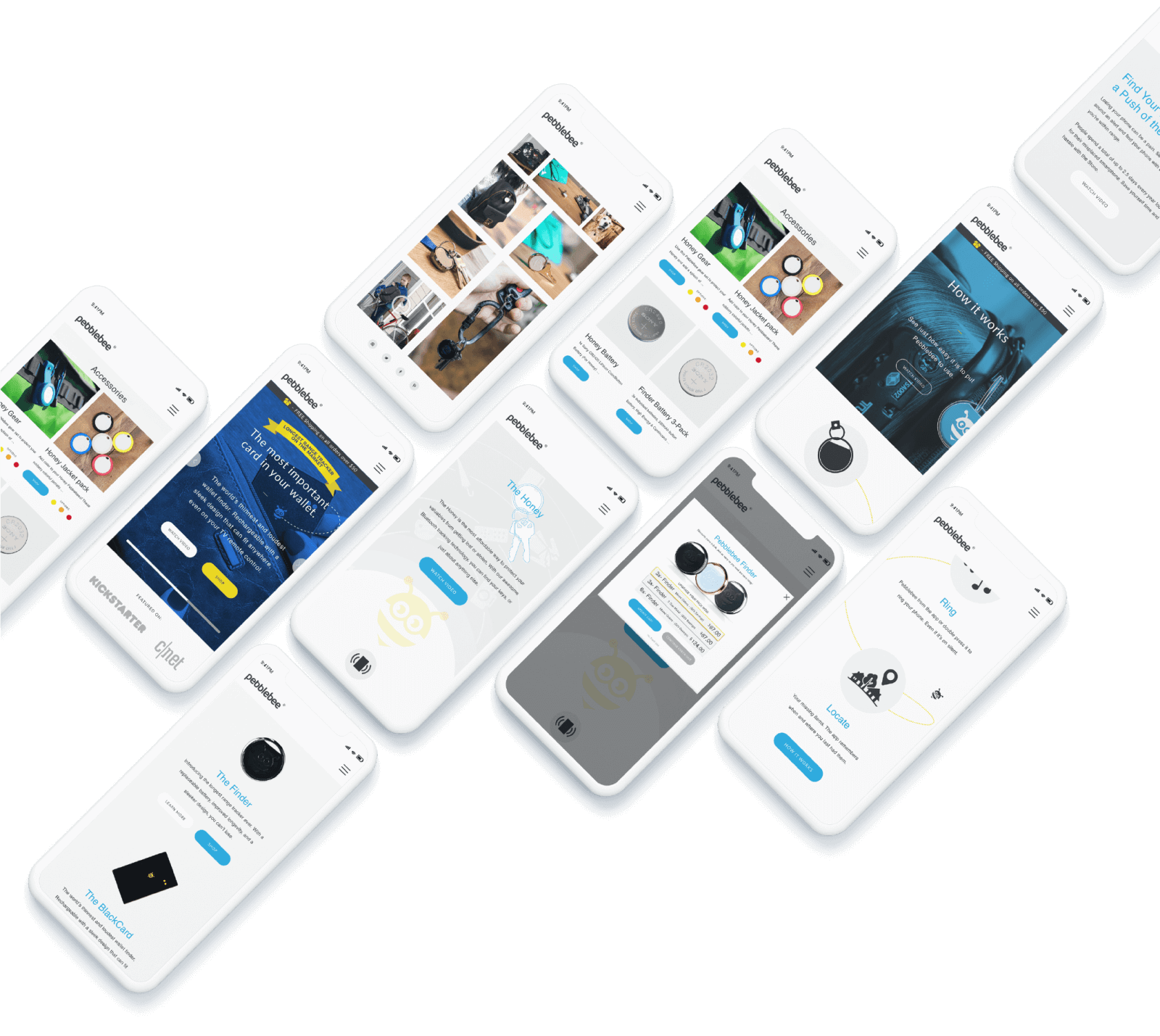
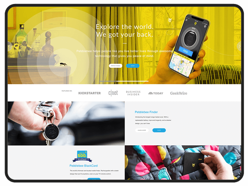
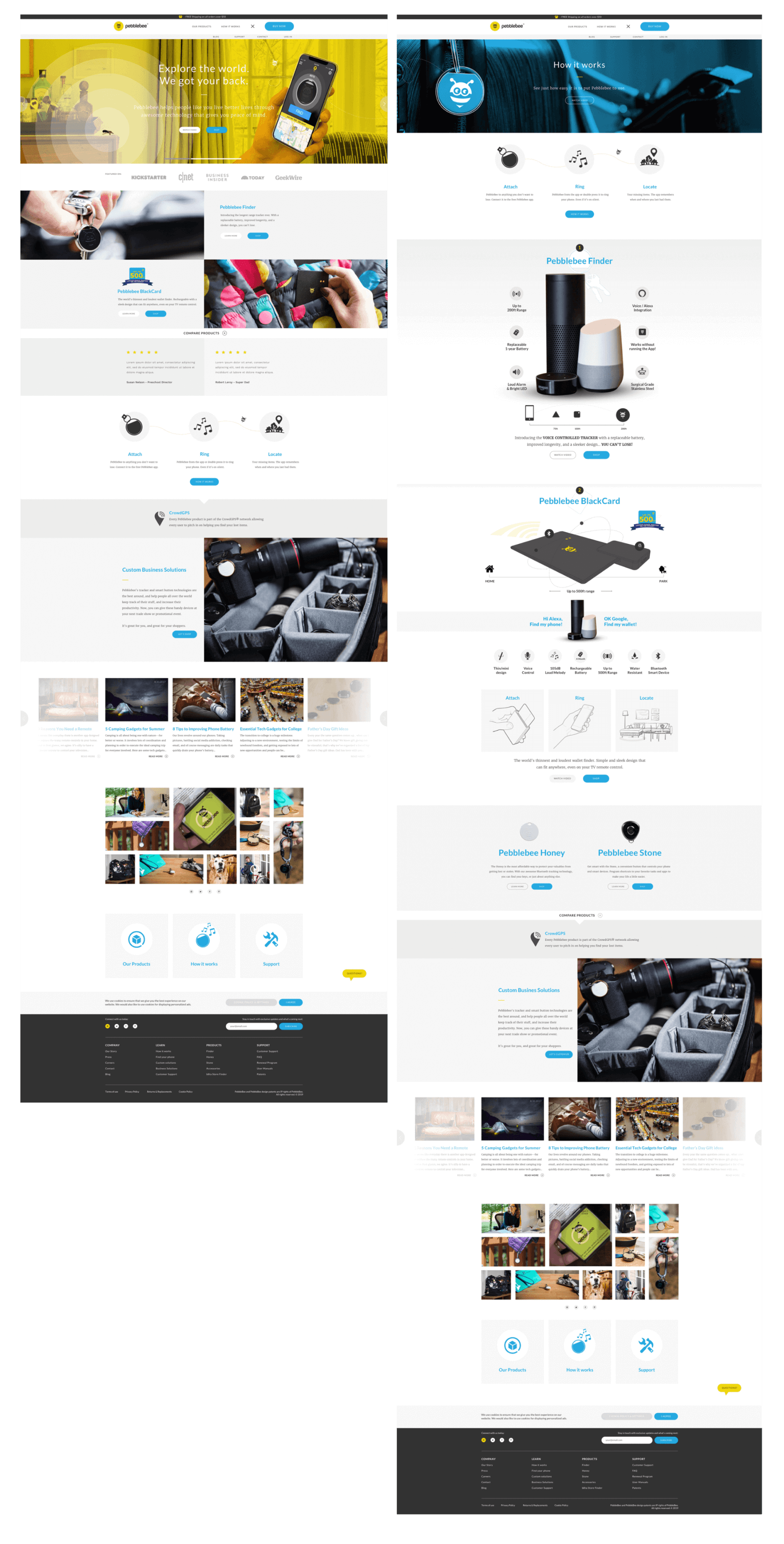
Grey-tones-framework – One of the most underrated tools in the toolbox. These grey-tones have a real job, they frame out the product stage, building upon depth and function. Allowing the white aspects of each photo to pop. They bring structure to the module based system, and consistency whether desktop, tablet, or mobile.

How it works – Taking the learning curve head on, by visually conveying products main purpose, and key benefits with a story format. By offering clarity, consumer frustration and poor reviews are avoided downstream.

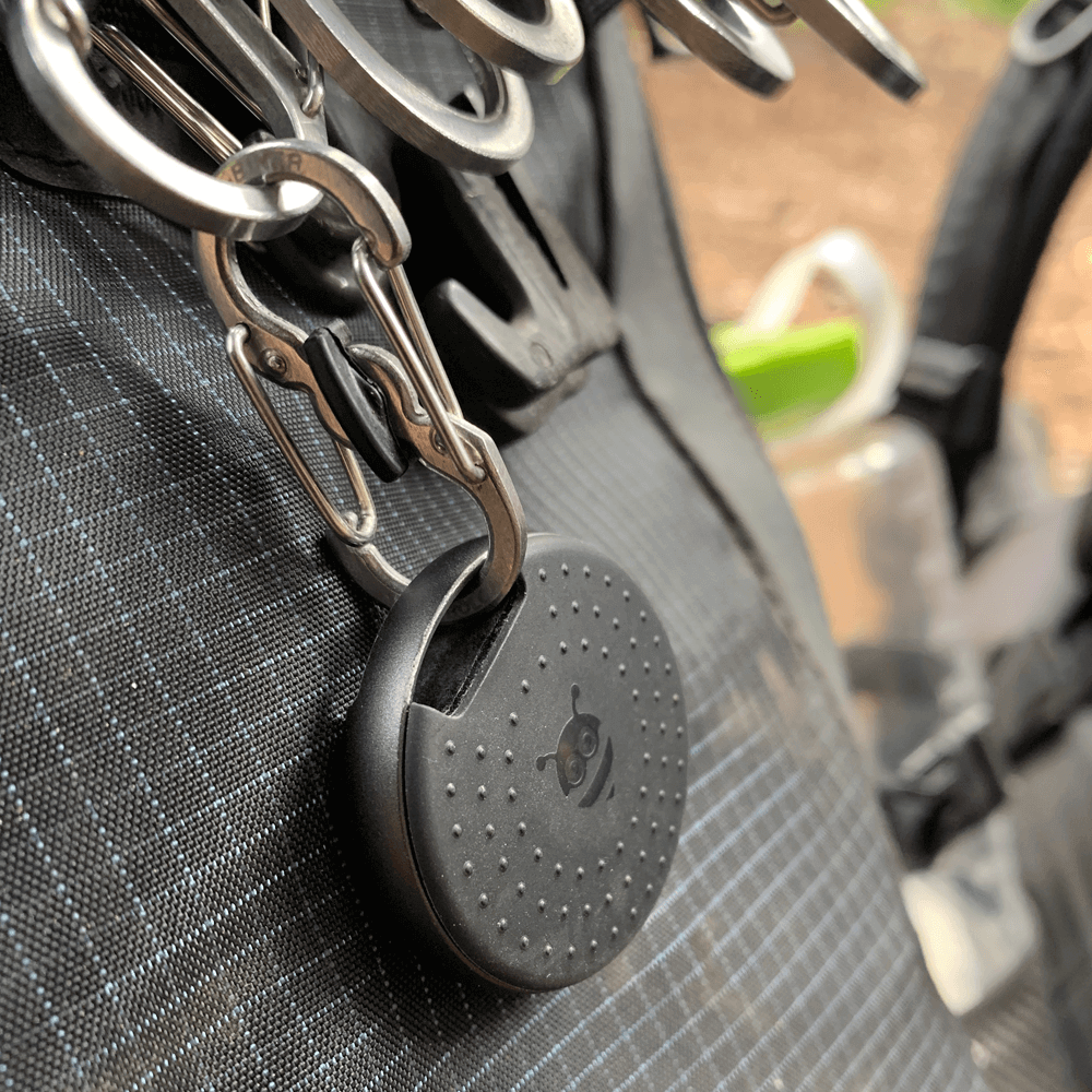
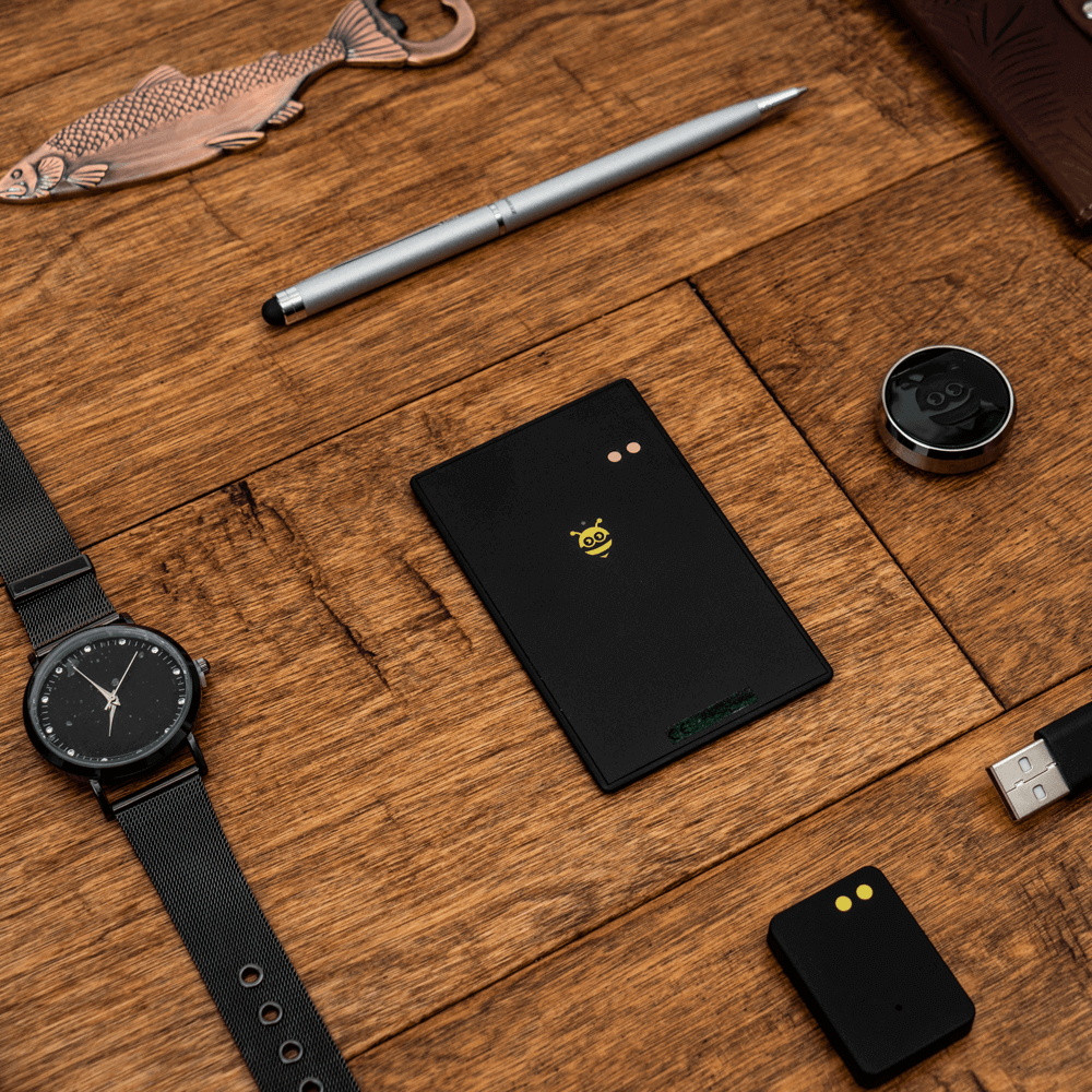
Pebblebee Bee – Painting the picture of the pathway, digitally retracing your steps and sourcing your prize.

Packaging System – With the updates of the Pebblebee ecommerce platform and design language, a refreshed packaging system was introduced for their presence in Costco. This opened the door to expanding to Costco Canada, which needed a multilingual solution on a time sensitive basis.

p1-slider-3-1
p1-slider-3-2
p1-slider-3-3
p1-slider-3-4
001
000

Positive collaboration will bring you full circle

With these new brand elements working as a team, Pebblebee experienced growth with their consumer following and revenue, by eliminating wholesale, and increasing margins through direct sales. By defining Pebblebees cohesive design language from the beginning, our work helped bridge the gap for many years of growth to come.

We want to thank our friends over at Pebblebee. It was a great experience contributing to their business growth and opening the door to in-house sales, marketing, and further product advancements.